Moiré worms
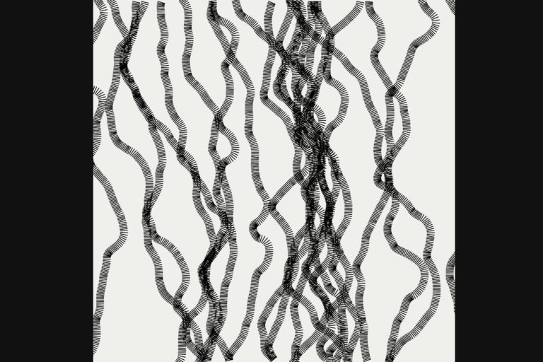
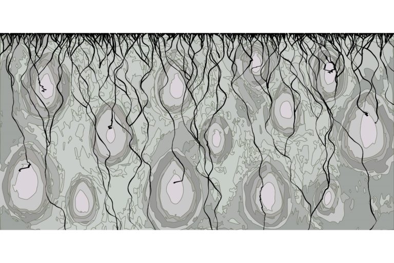
This algorithm builds an image up entirely out of short straight lines. The lines are being stacked underneath each other. However, each one is tilted in respect to the one before in a semi-random fashion. The fact that it is semi-random is important here, because if you would do it completely randomly, it would look really messy like shown below on the left (or below on a mobile). I have used a noise generator that is based on Perlin-noise, which makes the behaviour of the stack of lines seem much more organic, resulting in these worm-like patterns.

This is the same algorithm, but then using totally random noise. The result is pretty messy compared to the worm-like shapes of the original algorithm.
As more and more worms are forming they start to overlap. This results in additional patterns appearing as I have tried to illustrate in the images below.
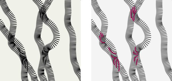
These patterns are known as Moiré patterns. This effect is caused by the interference of similar patterns that overlap. Below I have added an example of this effect. They are two slightly different stripe motifs, one is stationary (click on the blue square to reveal) and the other is moving slowly (click on the red square). Clicking on the other coloured squares changes the two motifs to reveal yet different patterns.
Click on the coloured squares on the left to hide one of the two patterns.
Click on the squares on the right to change the properties of the patterns.
Parallel curves
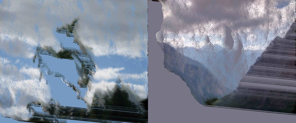
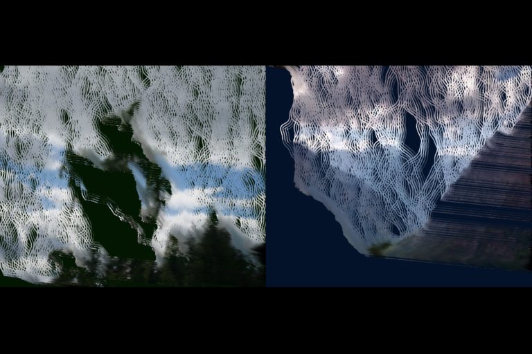
The algorithm behind these images uses a photograph as input. Once the algorithm starts, a line at a random point at the top of an empty canvas starts to move downwards, making shallow curves that are determined in the same semi-random fashion as with the Moiré worms code above that uses Perlin-noise. Simultaneously, a few lines parallel to the initial line are started. Parallel line are lines that never cross each other (see illustration below). The same principle counts for parallel curves, the distance between the curves is the same everywhere (see below). The lines are segmented into small pieces that take on the colours of the original photograph. Once the lines reach the bottom of the canvas the process is repeated and a new set of lines start from the top. In the works shown here the amount of repetitions of this process count up to about 100.
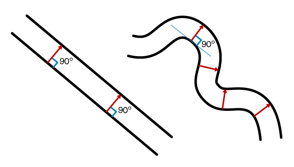
Left: two parallel lines that are separated by the same distance everywhere (red arrows) and therefore never cross.
Right: two parallel curves that using the same principle never cross.
The problem with this approach is that when a line make a curve that is too sharp for the parallel line to follow, something odd happens. This is best explained by the illustration from wikipedia below.
The algorithm, however, makes use of this unexpected feature. Every time that a bend in the first curved line is too sharp, the triangular shapes appear as shown in the picture above. The consequence is that a long segment of line is created that connects the two lines on either side of the bend. Many of these segments together cause a smear-like effect (see below). Each time a line encounters a dark area in the photograph, the line takes a sharp turn. This encourages the smear-effect to develop making it look like brushed paint.
a) Example of a line and the three parallel lines that are generated. The third line cannot form a smooth line in the bend and the triangular shape is formed.
b) When the line comes across a dark area in the photograph, a sharp bend is made. Here you can see an example of this and how it causes these triangles to form.
c) As the parallel curves encounter the sharp bend, these smear-like lines are formed.
d) This smear-effect makes it look like it is painted.
Bonus content for scrolling all the way down 😉
