Font Stark
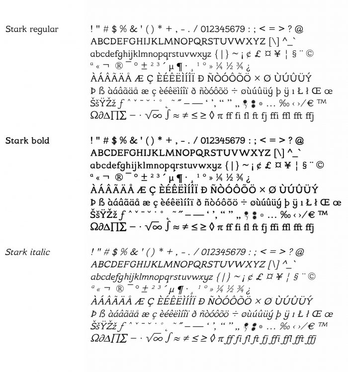
The font that is used for this website is a typeface I have designed myself. My partner Lawrie McKay and I were working on an illustration book for young children and this font is designed for that purpose. The Stark font family contains a regular, bold and italic version.
The font is named after my late father-in-law, Lawrie Stark McKay, who worked in the printing industry most of his life. First as a compositor, working with the hot metal letter plates and later with digital techniques. At a later point in his career he became director of operations for the UK’s largest typesetting company.
When I started working on my font I didn’t know anything about it, so I learned as I was working on it. Being able to ask Lawrie’s dad for advice and his opinion was very useful and gave me the confidence to continue working on it.
If you are interested in the font, I would be happy to sell you a copy, just drop me an email. I’m still working on the finishing touches, but I expect it to be ready soon. It will be available both as a web font (.woff & .woff2) and a normal font (.otf) that works with MS Office, Adobe and more.
In some old browsers (for example internet explorer 8 or earlier) the font may not work, in which case the website is in Times New Roman. An example of the font is shown above.
Our conscious visual perception is very susceptible to optical illusions. Several of these illusions play a role in type-font design. If you would design a font that completely adheres to geometric rules, e.g. equal thickness of strokes, the use of symmetric shapes and standardised dimensions, the font would look off and wonky. To prevent this you have to fool the brain into thinking that the letters are following geometric rules, while instead their design counteracts the visual illusions involved. The trick to designing the letters is to use your own eyes to adjust the design until it “looks good,” but that’s of course not easy. It helps, however, to know something about the illusions at play. Below I have collected a few well known optical illusions whose principles are taken into consideration when designing a font such as Stark.

Left: the two horizontal lines are of equal length, however, the bottom line seems longer.
Middle: the horizontal and vertical lines are actually of the same length.
Right: again, the two fat lines are equal.

Left: the two middle circles are the same in size.
Middle: the diagonal line is partially covered by a thick black line, but seems offset coming out at either side.
Right: the vertical lines seem to be leaning to different sides, but are actually parallel.
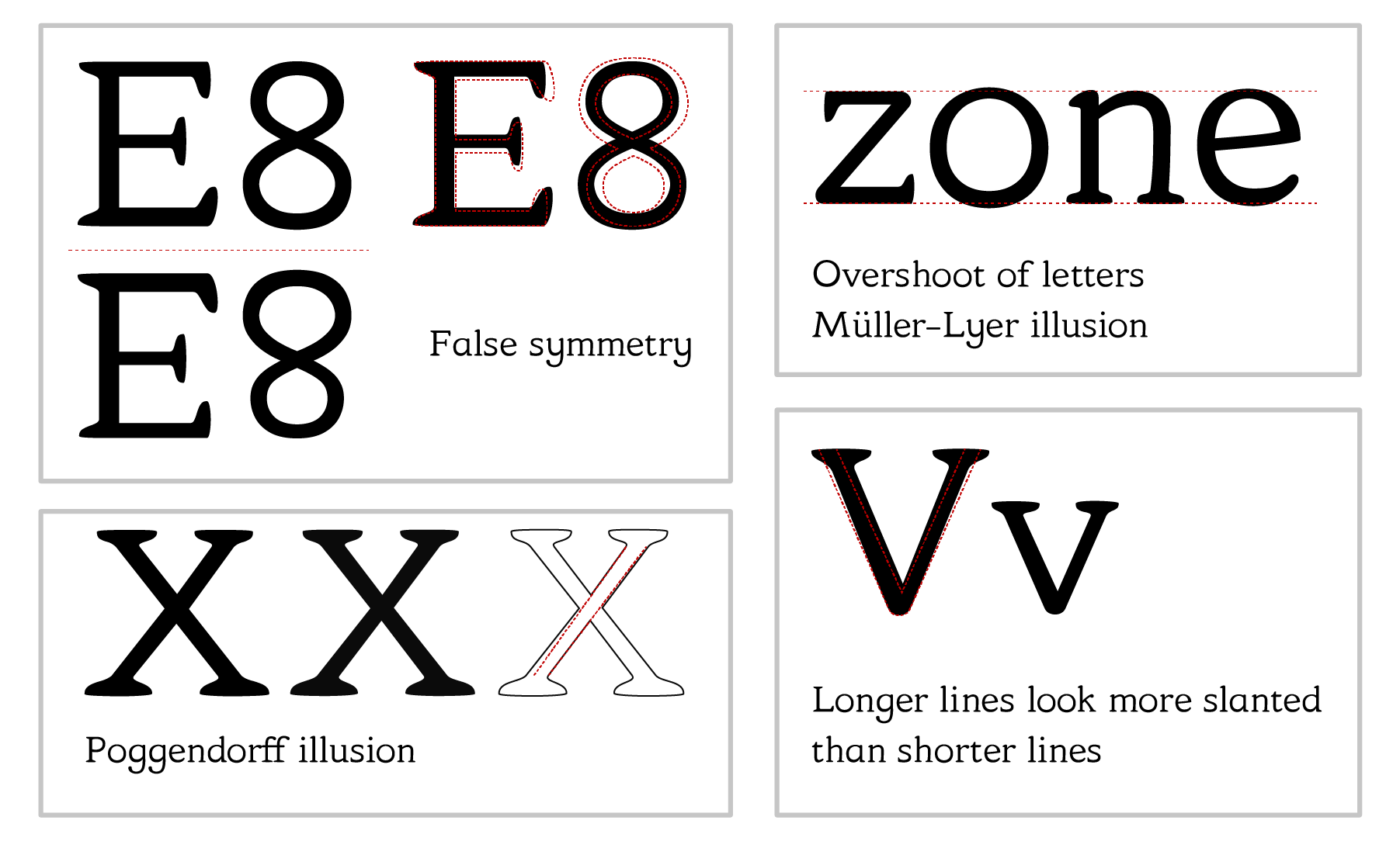
To illustrate how these kind of illusions play a role in type-fonts I have shown a few examples below. You may need to look quite closely as the letter adjustments are often subtle.

Top left: the E and 8 look symmetrical, but if you flip them around a horizontal line it becomes apparent that they are not. The bottom needs to be a bit fatter and the shapes a bit bigger to generate the illusion that there is geometric symmetry. On the right you can see the upside-down letters (red) overlaid on top of the normal letters (black).
Top right: due to the Müller-Lyer effect the height of different letters are varied slightly to make them look the same height while letters such as the “o” actually show an overshoot.
Bottom left: the legs of the capital “X” one the left are perfectly straight, while the “X” in the middle is adjusted to counteract the Poggendorff illusion. On the right you can see that the legs do not continue in a straight line after the crossing.
Bottom right: longer strokes look more slanted than shorter strokes. This is why the capital “V” would look wider than the lowercase “v” if the angles were kept the same. Instead a small correction is necessary to make the “V” look like a larger version of “v”. The red dotted line shows the angle of the strokes without the correction.
